Like what you see?

Made With
Peer Pressure and Lots of procastination
Oh, and coffee too.
Candidate Overview Presented in Excel-style Format
Applying Jakob's Law for Intuitive Candidate Insights in Excel Format"


Efficient Access:
Cost-Effective Email + OTP Login for Streamlined Security
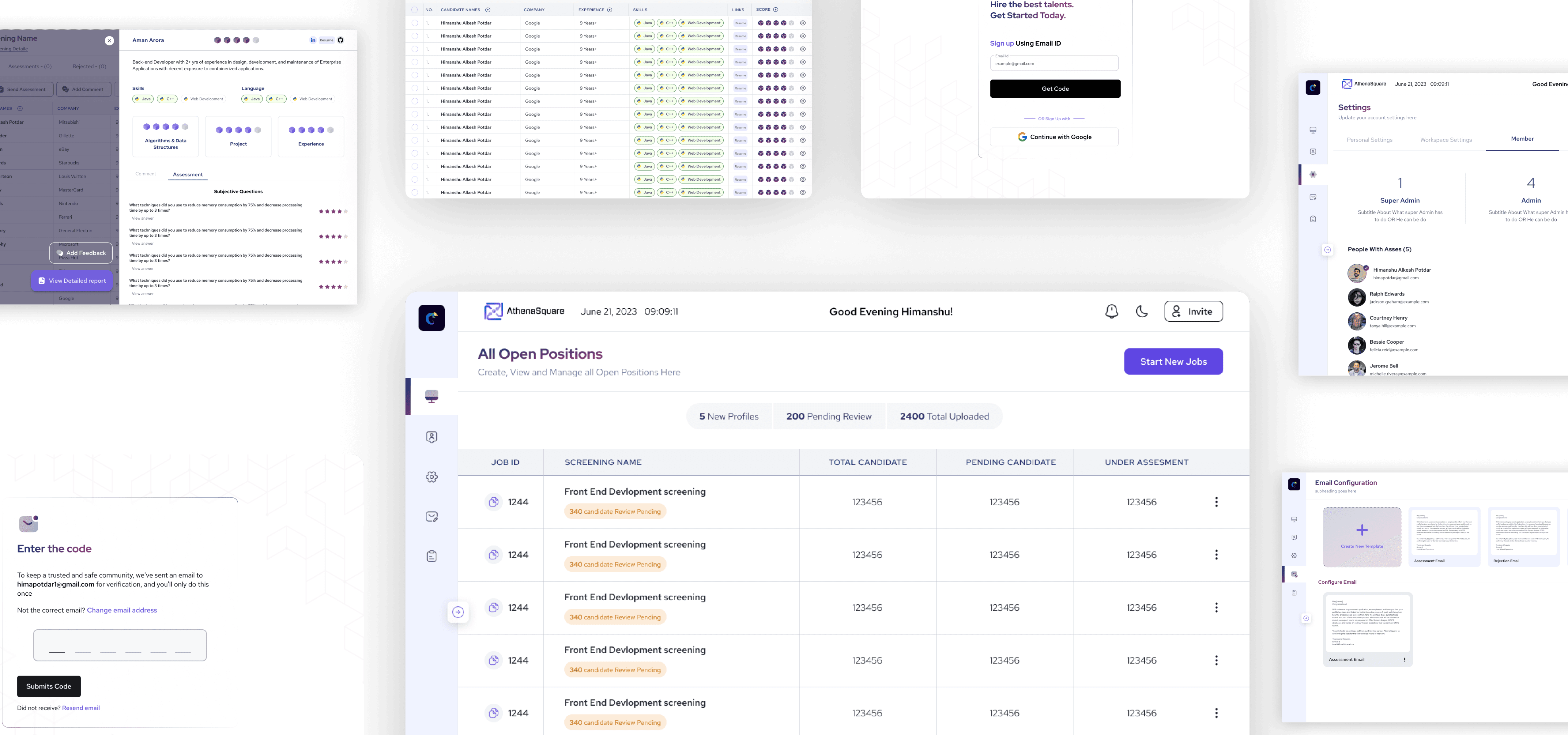
Enter the code
To keep a trusted and safe community, we've sent an email to himapotdar1@gmail.com for verification, and you'll only do this once
Not the correct email? Change email address
Submits Code
Did not receive? Resend email


User-Centric Interaction:
Embracing Popup-Style UX for Intuitive Filters and Options
From Concept to Interface
Redefining Candidate Evaluation at Athenasquare

View In-Depth Case Study
HR-Tech
ATHENASQUARE
Context
of Project
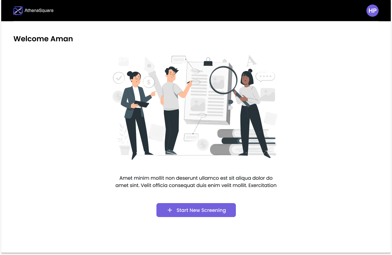
During my internship, I worked on Athenasquare, a revolutionary HR-tech platform created by Aman with the aim of simplifying the hiring process. My role involved both research and design to ensure a user-friendly experience. I was responsible for creating the product from scratch, which included an in-house resume parser that presents candidate details and ranks them based on their skills and job compatibility. Recruiters can also use an AI-based assessment test customized to align with candidates' resumes, for more insightful screening. The platform facilitates collaboration, allowing recruiters to work together seamlessly and foster a dynamic and efficient hiring environment.
In essence, Athenasquare represents a new approach to HR-tech, introducing a suite of tools that simplify and enhance the candidate screening process. From parsing resumes to AI-driven assessments, the goal is to make hiring more intuitive, collaborative, and effective for recruiters at every step
In a
Nutshell
Explore the
full story
It all started because
we aimed to validate our business model through a Minimum Viable Product (MVP). With a larger vision in mind, we envisioned creating AI-based solutions to automate every aspect of HR – from sourcing and screening to payroll management.
I wanted to achieve
A Business Goal
of optimizing hiring processes through efficient screening, ensuring faster candidate evaluation.
Design Goal
by creating an MVP to validate the idea and test the UX.
This iterative process will pave the way for the development of the final, go-to-market product, ensuring a user-centric and well-tested solution.
I approached the project by
Exploring
the problem through primary research
on the HR market and current recruiting processes.
Strategizing and Testing
through the creation of an MVP.
This step allowed for practical validation of ideas, ensuring the design aligns with user needs and expectations before moving on to the final product development.
Crafting
the final prototype, refining and incorporating insights gained from testing the MVP.
This step marked the culmination of the design process, ensuring a polished and user-friendly solution ready for the market.
Exploring
the problem through primary research
During the initial phase of my research,
I thoroughly examined the current HR technology landscape
I explored several popular tools such as


For ATS


for sourcing and candidate engagement


Screening & Assessments
To gain a better understanding, I personally explored these tools and interviewed users to gather valuable insights. .
As per my research, I came across three significant observations.
HRMS & ATS
products often struggle with poor search, analytics, and matchmaking capabilities due to their large databases
Sourcing & Candidate Engagement
tools face challenges in efficient matchmaking and filtering of candidates, lack personalized engagement, and exhibit poor integration with HRMS and ATS platforms
Screening & Assessment
tools have limited question banks, require high manual effort and cost for screening and interviewing candidates, and exhibit poor integration with HRMS and ATS systems.
Designing Athena's Unified Design Framework


Explore the Landing Page and its Case Study
A closer look at the intricacies and design thinking behind our SAAS product's landing page through a comprehensive case study
View Case Study
Strategizing and Testing
through the creation of an MVP.
With the insights we've gathered from our research, Aman, who is the design guru and founder of Athena, and I will collaborate to
brainstorm and develop the initial streamlined user journey
Landing Page having CTA
Start Screening
After that user will landed
on login screen.
After filling the info User
will landing on dashboard
User will create Screening
as per job requirement
Then user will add
Resume of candidate
Meanwhile, our AI Scoring mechanism will rank user.
Ranked List of candidate appear on the dashboard then, User will decide action like - Take an, assessment, schedule interview etc.
We use this user journey
to create
some screens

Login Flow
I'm keeping the login flow super short and simple to tackle bounce-offs and keep the dropout rate low.
Create Screening
For the initial iteration, I have decided to create a two-screen start screening section. The first screen will require the user to provide their name and job description, which will help to rank them better. After that, the user will select the skill block and click on the start button to proceed to the second screen.
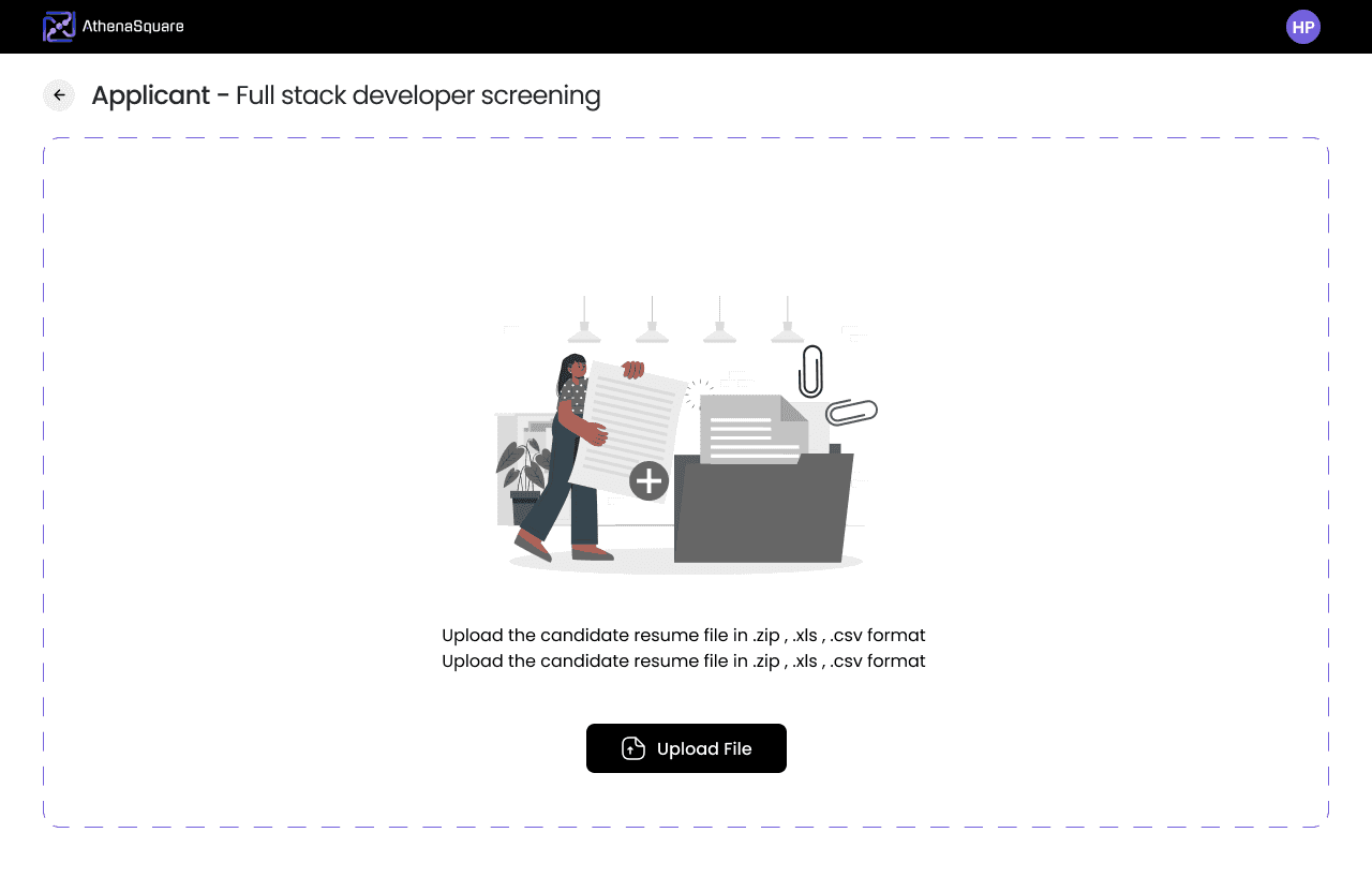
The second screen is for uploading the candidate's resume. However, there is a catch. The user can either upload their resume or enter their email address. If the user chooses the email option, the candidate will receive an email from Athena with a form to fill in the necessary details.


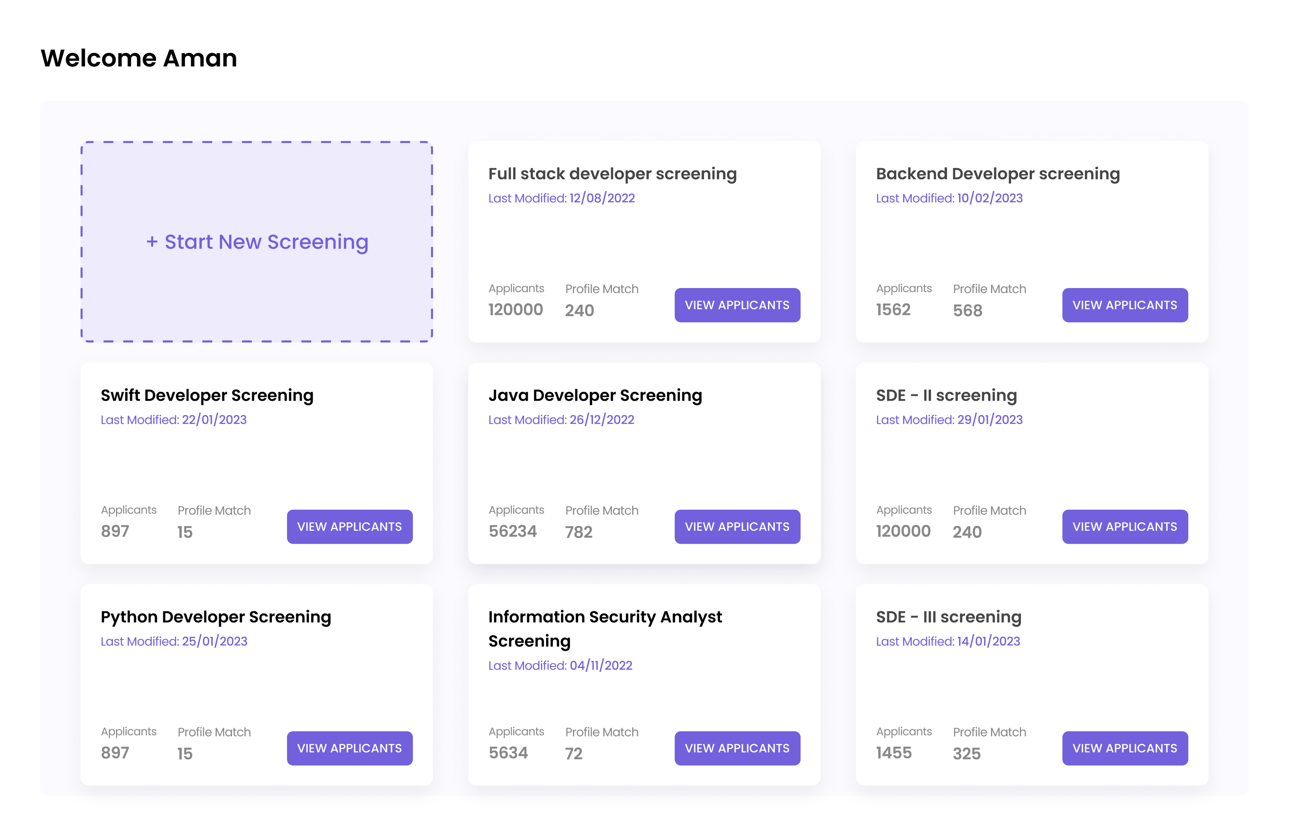
Dashboard &
Candidate list
After creating the screening, the user is directed to the dashboard where they can see a list of screenings. Each screening includes a list of candidates that are ranked based on the job description. The user is also able to filter the candidates.


Iteration #2
We put together this screen to get a grip on the problem, understand the ATS user flow, and map out features. After that,
we roll out
Version 2 - the real MVP
that's goes under development and testing with users.
as its a MVP so for a testing purpose
We keeping Login Flow same
After login user will landed on this
Dasboard
The major changes were happen in
start screening section
We decided to remove the job description upload feature as it was difficult to scan for the required information and there was no control over the content. Users could enter anything they wanted, and we couldn't moderate it, so we got rid of it.
When it comes to ranking candidates, skills and experience are the most important factors. We divided the skills into two categories: must-haves and nice-to-haves.
We have also removed the functionality for sending emails. We found out that most HR professionals were not using it, so we removed it to improve usability.

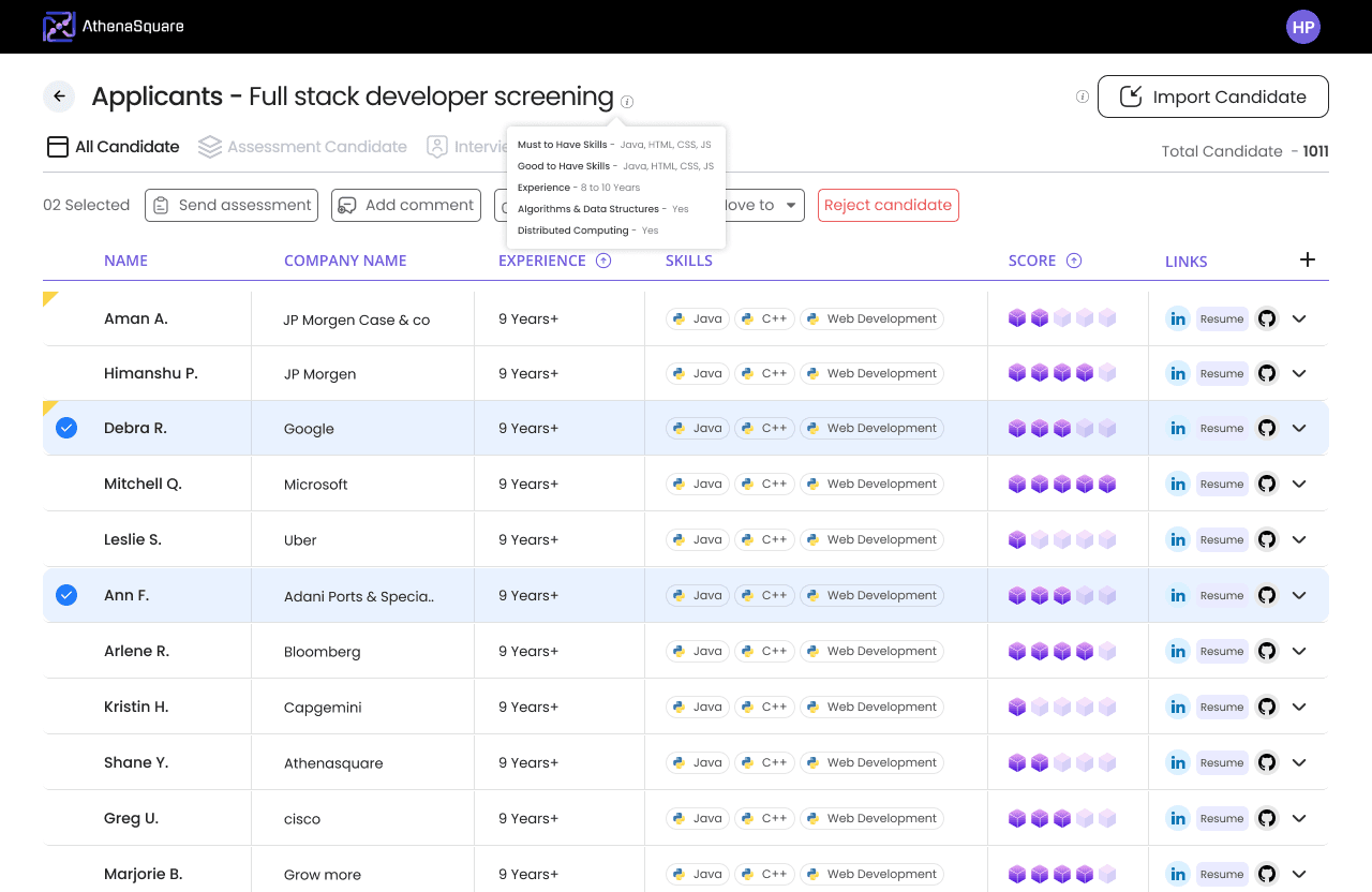
The another changes is happen in this
candidate listing section

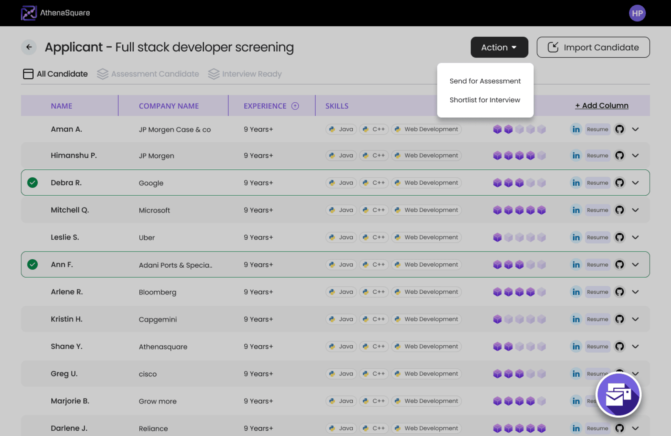
Initially, we have created default tabs for three categories of candidates: All Candidates, Assessment Candidates, and Interview-Ready Candidates.
The Action Button gives users or recruiters the flexibility to choose the desired tab and send candidates accordingly.
Want to keep a record of candidate scores? No problem! User can export the list in CSV format.
Moreover, User can add more candidates anytime by clicking on the 'Import Candidate' button.
let's talk about the Action button. This button is all about shortlisting candidates, whether it's for assessment or for an interview.
Users just gotta pick the candidate and then hit that action button to make their move.


When you hit the 'Send Assessment' button, boom, a popup shows up.
You get the choice to send assessments in bulk — either to everyone or you can be picky, sending it to the top 50, top 80, and so on, using the control bar.
Plus, you can tweak the email that's going out to the users. It's all right there in the popup.
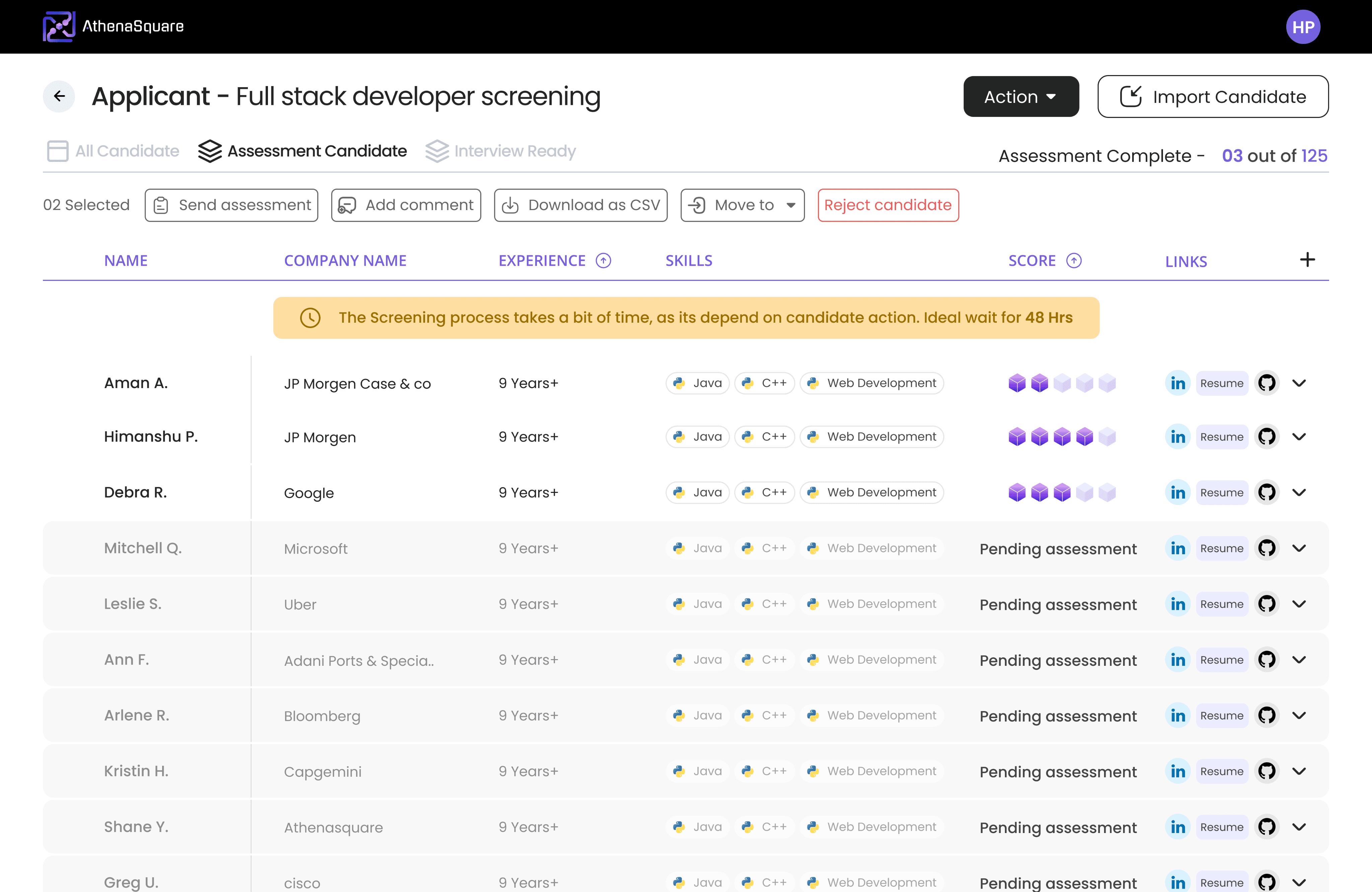
Check out the Assessment tab view. Here, you'll see the candidates listed based on how they did in the assessment.

Iteration #3
After testing our MVP with recruiters, we received
valuable
feedback.
We carefully
listened and implemented
the necessary changes, resulting in the
next iteration.
Since we're making this for the company, recruiters had some big suggestions for the
onboarding process.
Time for some major changes!

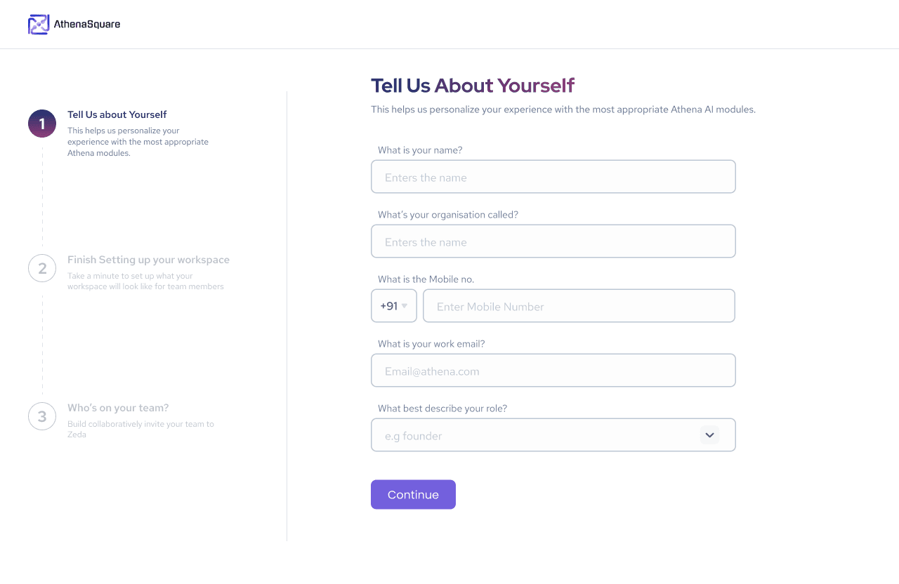
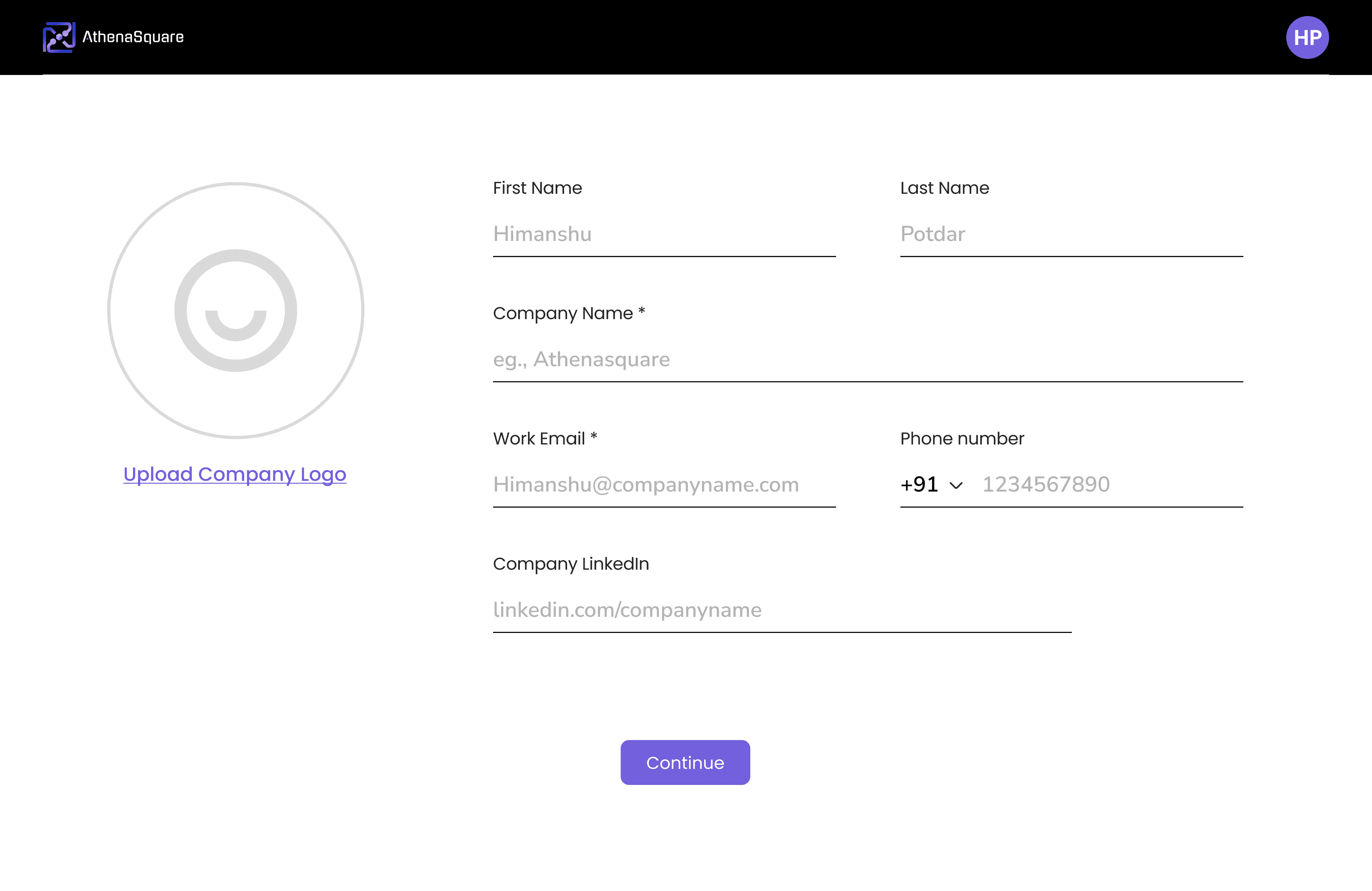
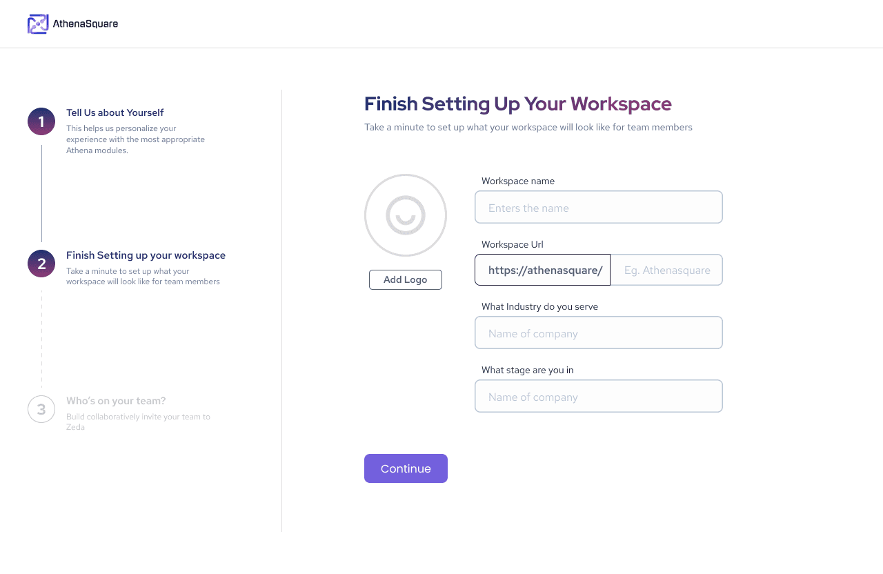
We break down onboarding into three main parts:
Info about the user
Info about the company (especially if it's their first time onboard)
Adding members to the team (for first-time onboarding)"
So, here's the deal: we're all about the 'one company, one workspace’ model. When a recruiter hops onboard, they create their company workspace just once.
Now, if someone from the same company with an existing workspace shows up to join, they just fill in their info and bam! They're off to the dashboard in no time.
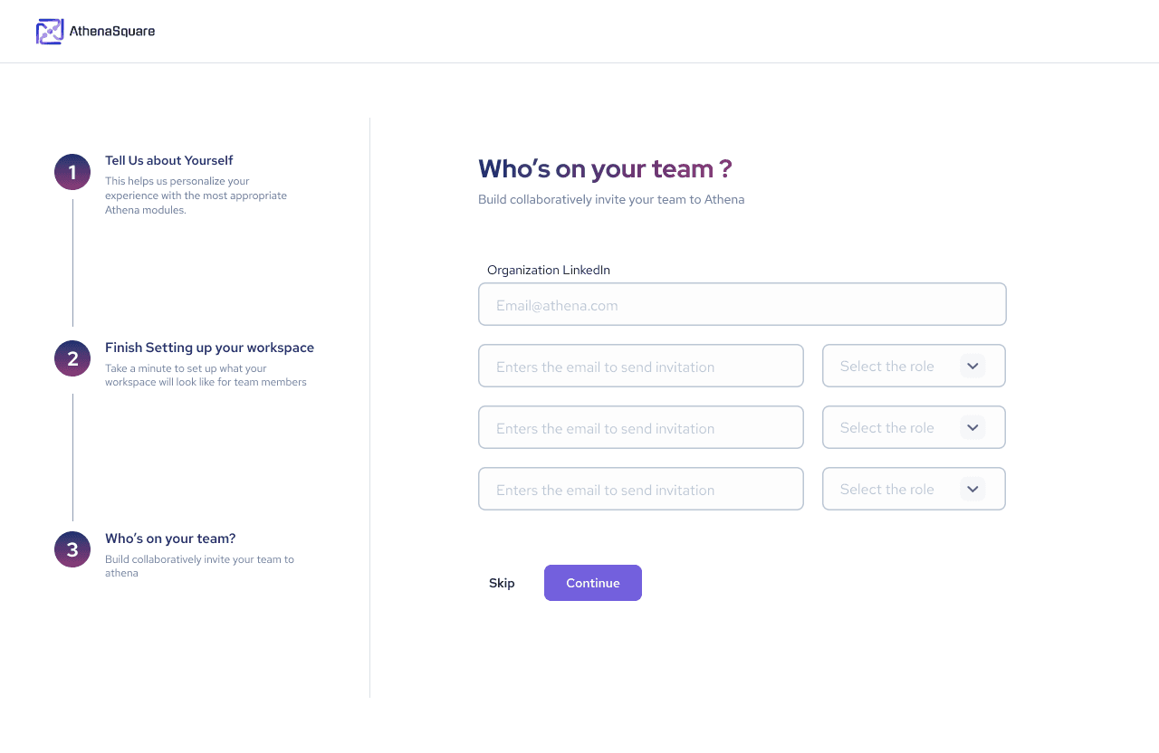
Not everyone in the workspace wears the same hat. We've got three main roles – Superadmin, admin, and member. Check out the 'Member section' further for all the juicy details."
Now, let's dive into the.
dashboard
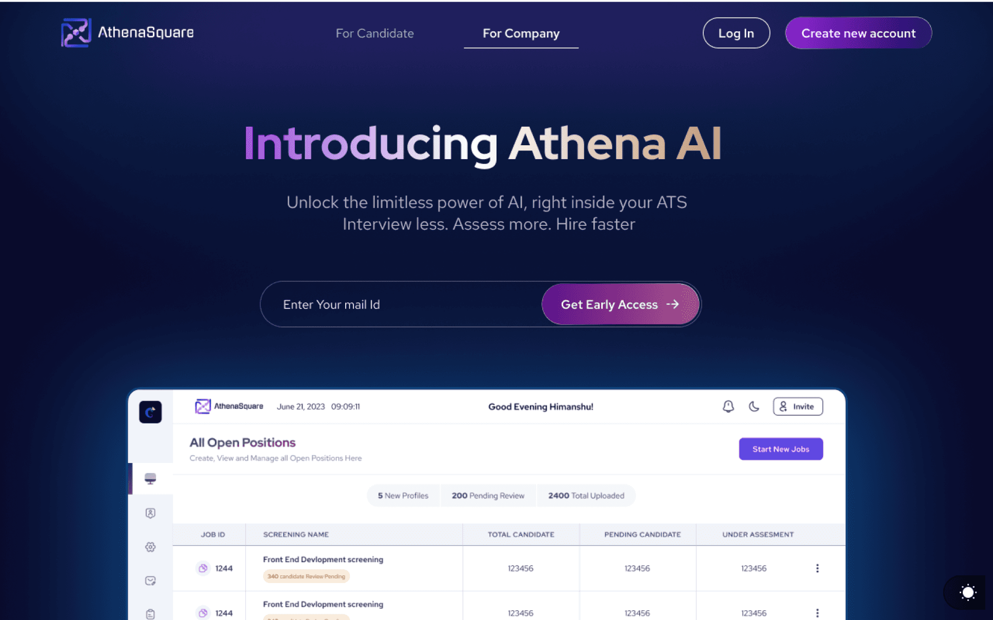
We've sliced it into five tabs:
All Candidates: Your one-stop-shop database with all candidates and their resume scores used in the workspace.
Screenings: The dashboard's main hub where you see the list of all screenings happening in that workspace.
Settings: For tweaking and changing up the workspace settings.
Post a Job: Need to put up a job on Athena? Hit this tab.
Email Configuration: Manage and create drafts for different emails – all in one place
Let’s have a look at the
‘All Candidate’ section
It's a valuable database that contains all the candidates and their respective resume scores used in our workspace.
This database plays a crucial role in enabling our company to swiftly fill any position that opens up.

Now, sneak a peek at the
Settings page
This is where users can tweak things around.
It's like a three-section wonderland - first up, workspace settings, then member settings, and the grand finale, billing info.


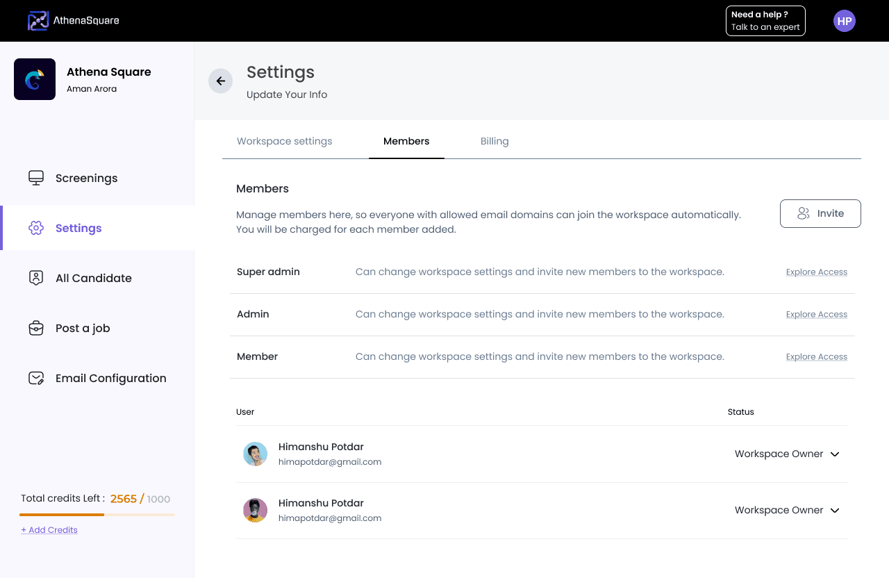
In members section Super admin has authority to change the assess admin and member.

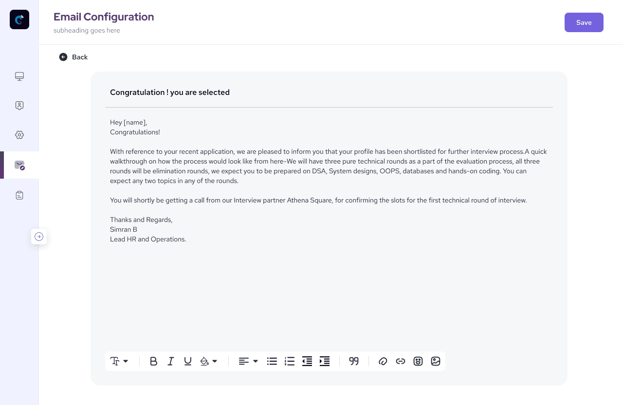
Here's the
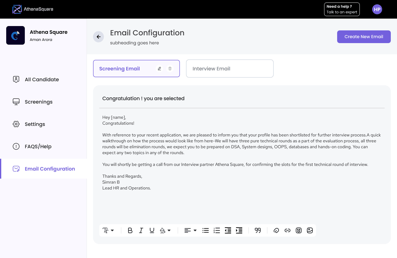
Email Configuration tab –
the place to be for managing and creating drafts for all sorts of emails. Everything email-related, we packed in one spot.
Time to check out the main deal – the
Screening Section.
It's like the heart and soul, also known as our home screen.
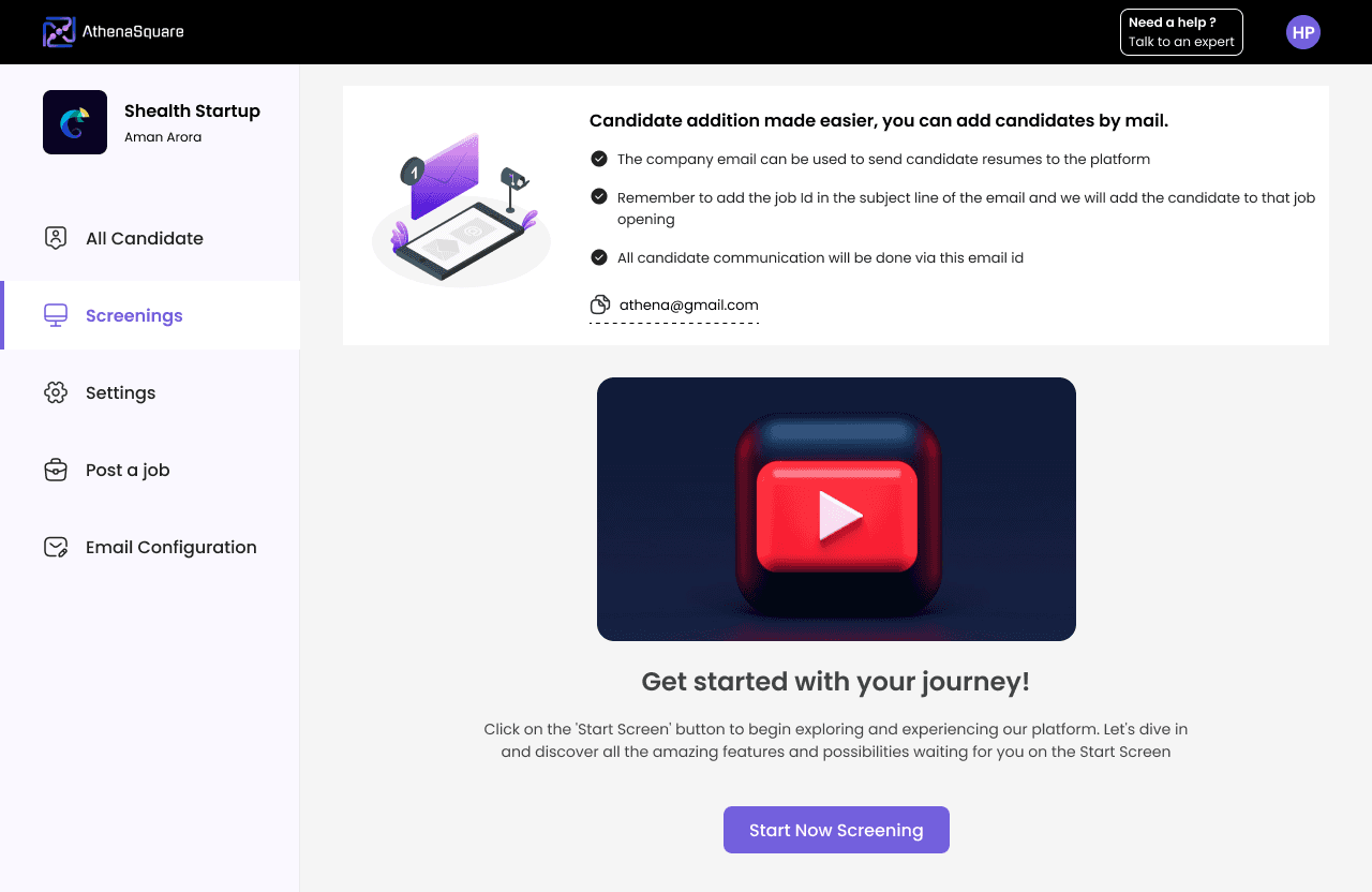
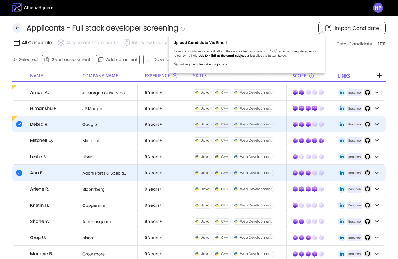
Let’s have a look at the screening section's blank view, which highlights our latest feature. You can now upload resumes through email! Just send the resume to the designated email address, and it will be parsed, scored, and added to the appropriate screening automatically.
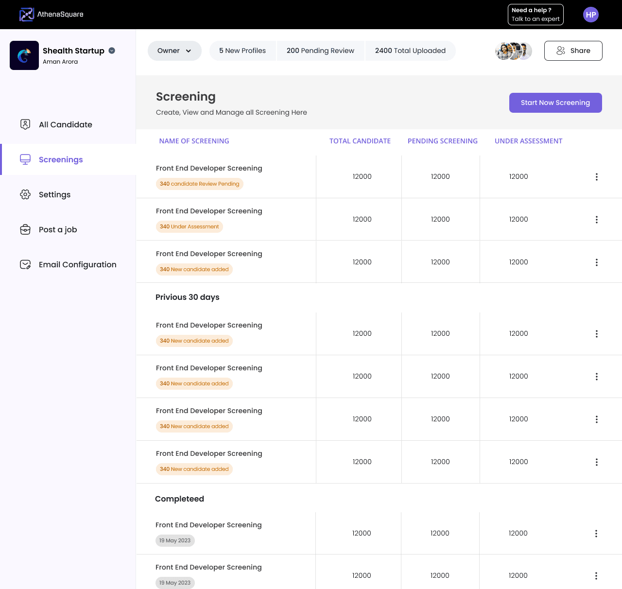
When you click on a specific screening, bam! You get a list of all candidates with their scores neatly laid out.
Do your thing – add comments, send assessments, or shuffle them around to different sections, all with just a click of a button.

When you hover over the 'i' icon next to the screening name, you'll get the scoop on what that screening's all about.
Same goes for the 'i' next to the import candidate button – just hover over it, and you'll learn all about how to upload candidates via email.
When the user wants to assess a student, they can simply hit the "send assessment" button. Users have the option to send assessments in bulk or to selected students.

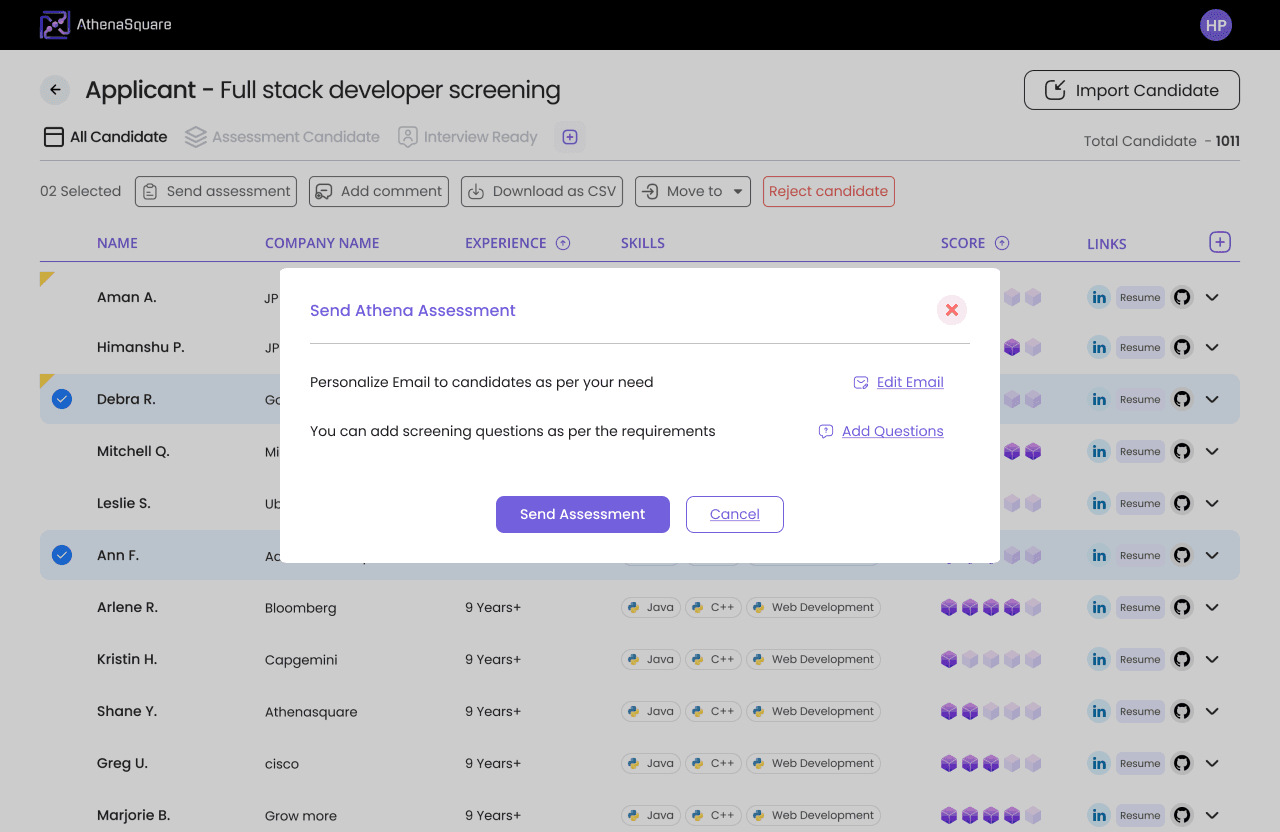
You will find two clickable options "Edit Email" and "Add Question" in the UI.
Let see there detailed view.

Let’s peek into the Assessment tab. It's kinda like the 'All Candidates' screen but with the latest scores. And guess what? It comes with two cool twists.
First, there's a view where you see who took the assessment and who didn't.
The second one? You get a heads-up notification when it's time to send a reminder mail, 48 hours post-assessment.

When you click on the candidate's name who gave the assessment, a side panel pops up, giving you all the details about their knowledge based on the assessment they gave.

Crafting
the final prototype.
After three months of teamwork with six of us and lots of coffee,
we're excited to
unveil our final
creation. Take a peek!
The first thing we noticed as a team was a whole bunch of mismatched and inconsistent designs.
So, we decided it was time to whip up a
design system to keep things in line.


Check out the end-to-end
Design System

We made a quick tweak in onboarding. Initially, we used the mobile number + OTP format for login, which was cool. But, since we're an HR-tech product and emails are kind of our thing,
we decided to switch it up to Email + OTP format for login.
Plus, sending SMS OTP isn't free – companies gotta pay up for that!
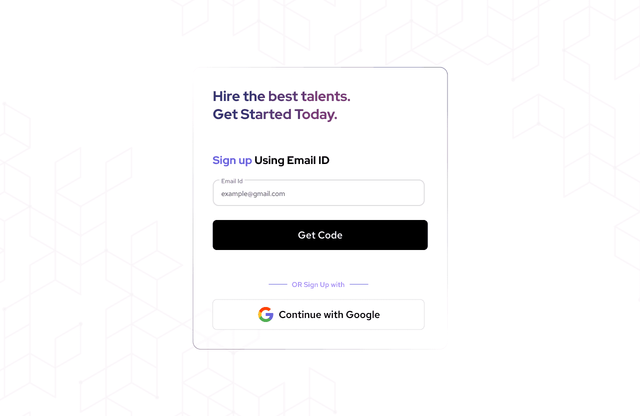

We left the rest of the onboarding flow just as it was before.
Notice the big UI shake-up in the 'All Candidate' section? We dropped in this cool AI search feature.
AI search feature.
Now, it helps you dig up the perfect candidate from the huge database hassle-free.

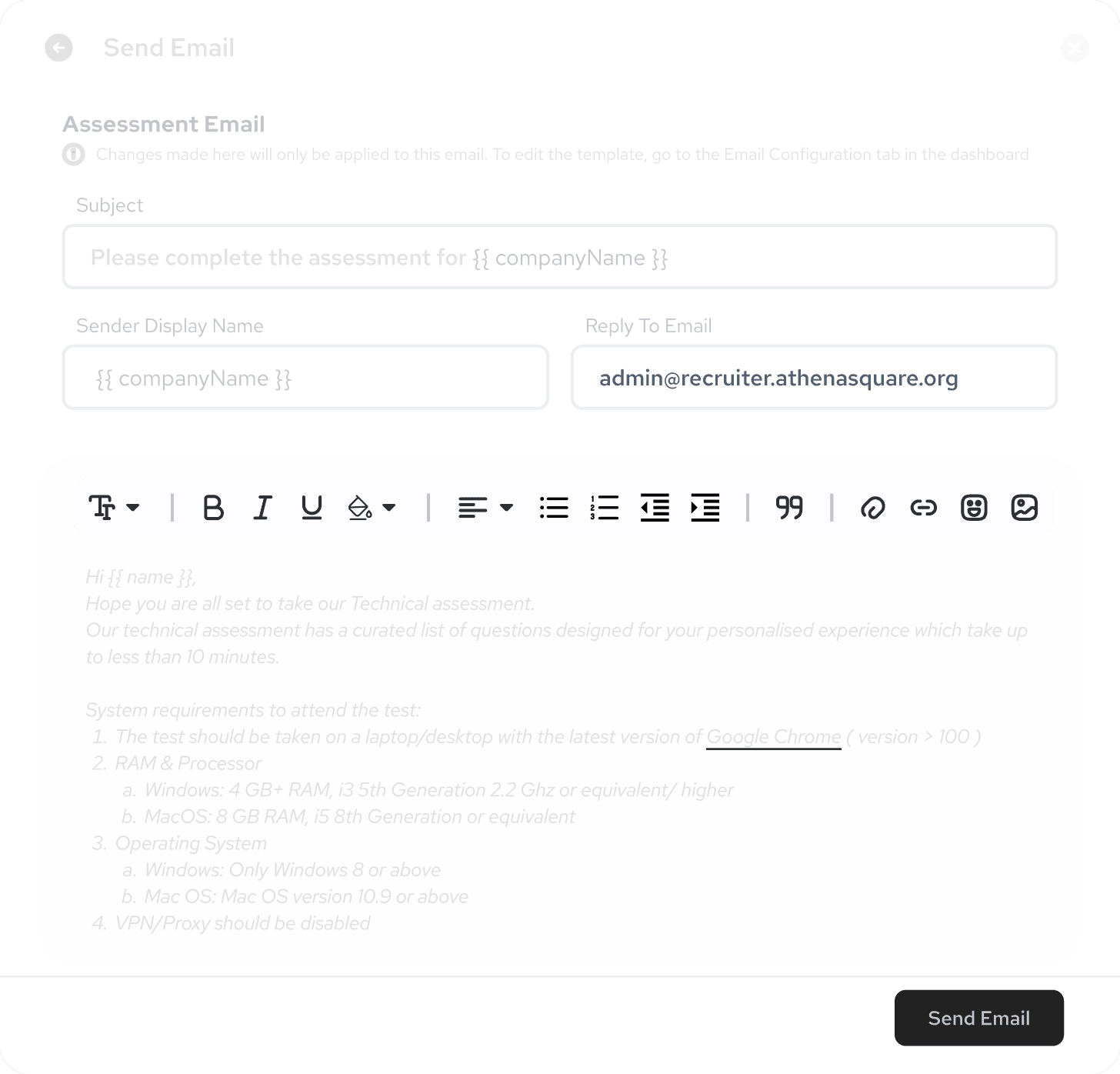
We made some big changes in both the UI and UX of the
Email Configuration tab.
So, while testing the tool with users, we spotted a hiccup in the Email Configurations section. Turns out, most users were scratching their heads about what kind of emails we'd be sending to candidates.
So, we threw in some sample email templates – the ones folks usually use. Users can either use them as is, tweak them a bit, or even create their own custom emails if they want.

We're throwing in another tab called
Activity Tracker.
It's like your personal logbook where you can see all the activity and logs of resume uploads, emails sent, and their status.
So, when Lightspeed Venture got their hands on our product, they pointed out a UX issue
Here's the deal
when multiple folks use the tool collaboratively in a company, lots of resumes get uploaded or emails sent to candidates. Sometimes, uploading resumes takes time and even fails. Same goes for emails. To keep tabs on the status of emails and resumes, we brought in this new tab.


Let's dive into the important stuff –
Screening section.
We've made some major changes to the UI of this section and aligned it with our design system.


To kick off a new screening, users need to fill out this form. You'll notice a UI change here. Also, in the Screening Parameter section, we've made a UX change.
Recruiters wanted to screen candidates in all parameters but with different weightage. So, we ditched the toggle and introduced percentage sliders to choose the weightage.
We've also rolled out a new add-on feature called Career Page. Companies can now create their own career page on our portal and post jobs directly there.
When creating a screening, users can simultaneously post a job for that particular screening. Just click the checkbox 'Post as a job' at the end of the screening form. When you click it, an extended form will pop up. Fill it out, hit the button, and boom! Your job gets posted automatically, and the screening is generated too.
The benefit of creating a job in our portal? You don't need to upload candidate resumes. Resumes are parsed automatically and scored and ranked automatically too.
After creating the screening, users land inside the screening. Initially, a blank section pops up with the 'Import Candidate' button.


As soon as users upload candidate resumes, AI kicks in to parse, score, and rank them. We've kept the UI similar to Excel, since most recruiters use Excel tables for screening. Placed the action button above the table, just like in Excel and Google Sheets.
As soon as users upload candidate resumes, AI kicks in to parse, score, and rank them. We've kept the UI similar to Excel, since most recruiters use Excel tables for screening. Placed the action button above the table, just like in Excel and Google Sheets.
Let’s taka a view of actions performed By User
#Action 1 - Send email

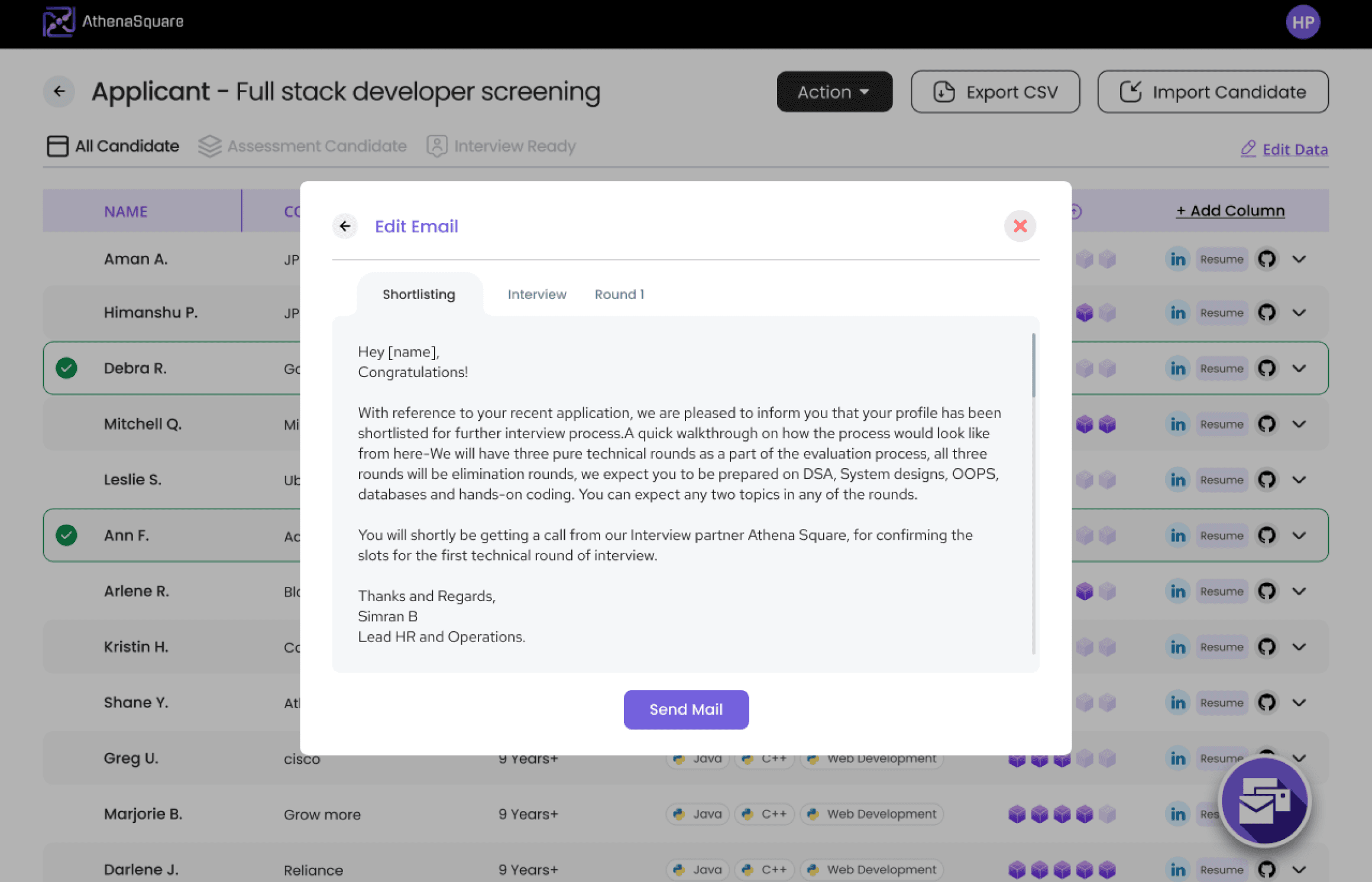
This pop-up shows up when the user hits the 'Send Mail' button
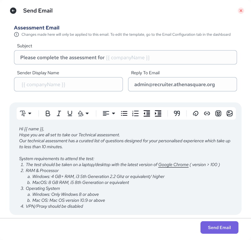
When the user selects the mail template from the dropdown, the next pop-up appears. This pop-up is for a quick edit of the email for that specific candidate or a bunch of candidates. It's a one-time edit valid only for this email.
#Action 2 - Send Assessment

This pop-up pops up when the user hits the 'Send Assessment' button without selecting any candidate. Here, we offer a bulk assessment sending feature. Users can send assessments to all candidates, or they can get picky and select, say, the top 10% or top 50% of candidates to send assessments to.
#Action 3 - Add Comment

Since it's a collaborative tool, understanding each other's take on a candidate is key. So, when a user selects a candidate and hits the 'Add Comment' button, this pop-up appears for sharing thoughts and comments.
#Action 4 - Import Candidates

This pop-up appears when the user hits 'Import Candidate.' We've added drag-and-drop functionality here and also provided a brief on sending candidates via email.
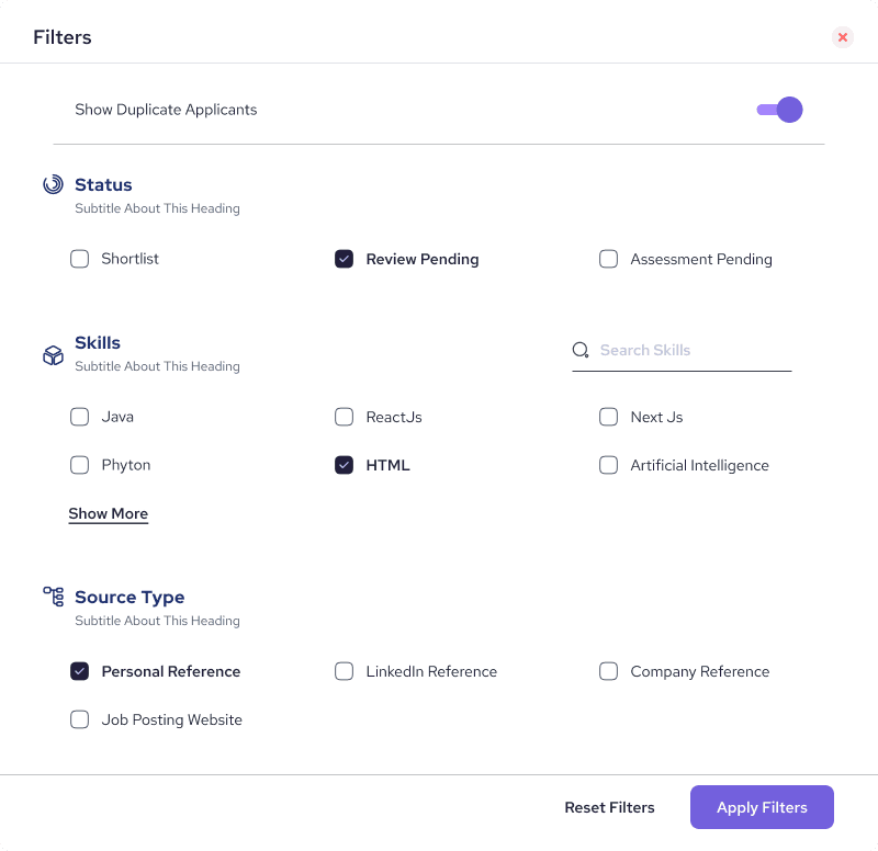
#Action 5 - Filter Button
We've got filters right in a pop-up. Let's check them out!
#Action 6 - Add Coloumn
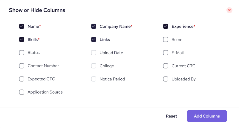
Recruiters love to compare candidates on different parameters, right? So, we made it easy. Just click the '+' icon at the end of the table header, and this pop-up comes up. Choose which field you want to add as a column – simple as that.
You'll spot the eye icon at the end of every row. It's there to showcase the detailed view of the candidate in a
Side panel.
We're rolling out some major UI and UX changes in this section. Let's dive in and check them out!
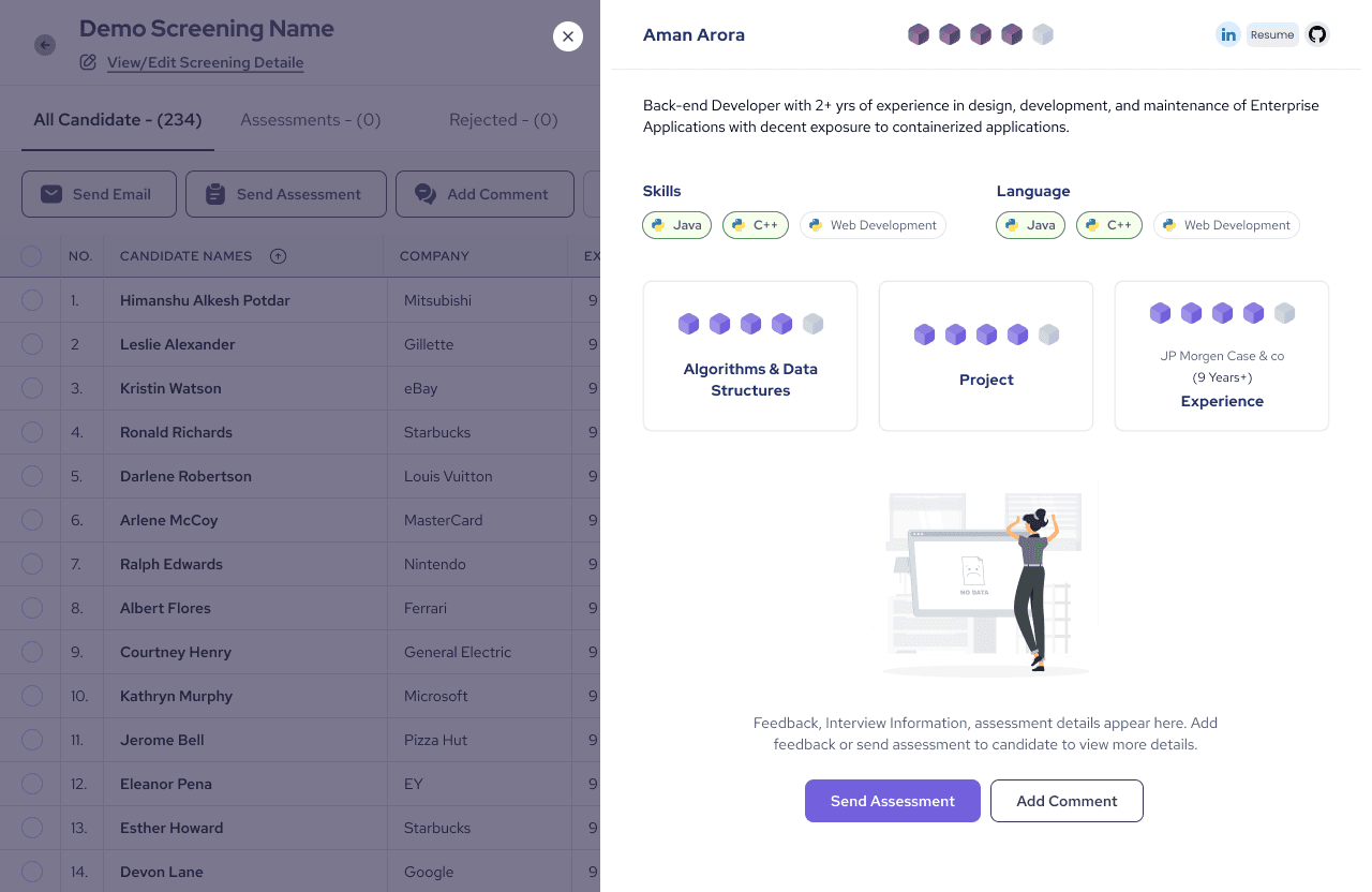
This is the blank view of the side panel when the candidate hasn't appeared for assessment yet.


Let's check out the last screen, the
settings screen.
We split the setting Section into 3 section as Personal setting, workspace setting and members.
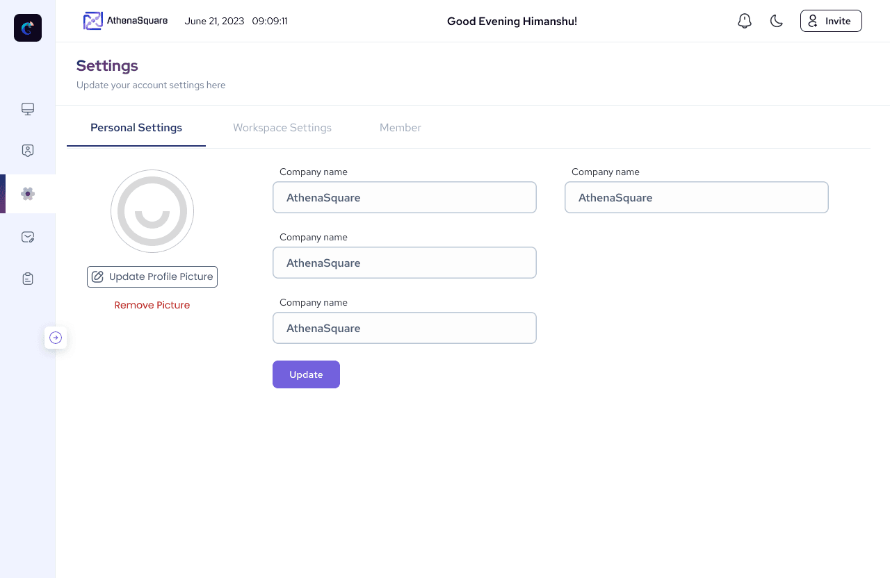
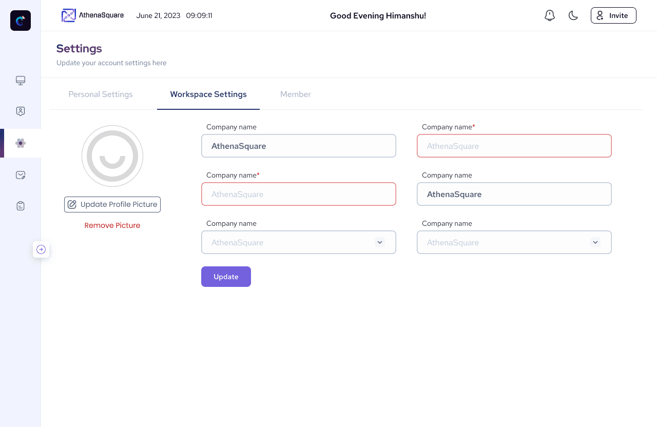

As we testing this product with different startup initially we let them use this tool for free hence we remove billing section from Setting Page.
And finally, after numerous debates with PMs and countless cups of coffee,
we launched Athena's Screening tool
The total resumes parsed till date is
36,000+
and Counting
We've successfully closed a total of
85 screenings
till date,
Currently,
21
big and small companies are utilizing this tool.
Here are some famous companies that are using this tool
